|
Art (paintings, prints, frames)
|
|
 |
|
|
|

Price :
$125.00
John Sloan “Sally Comes In†Original Limited Edition Etching
This and the others listed are all from “Of Human Bondage†Limited edition of 1500 More »
John Sloan “Sally Comes In†Original Limited Edition Etching
This and the others listed are all from “Of Human Bondage†Limited edition of 1500 NUMBERED in the COLOPHON Only: #800 (1915). Printed on high quality laid paper, plate mark measuring 4 by 6 inches and published 1938 by the Limited Edition Club. Each etching is plate signed and NOT INCLUDED with the original Colorphon BUT may be downloaded for your records. These are all in good condition, free of foxing, tears or stains.
John French Sloan (August 2, 1871 — September 7, 1951) was an American artist. As a member of The Eight, a group of American artists, he became a leading figure in the Ashcan School of realist artists. He was known for his urban genre painting and ability to capture the essence of neighborhood life in New York City, often through his window. Sloan has been called “the premier artist of the Ashcan School who painted the inexhaustible energy and life of New York City during the first decades of the twentieth centuryâ€, and an “early twentieth-century realist painter who embraced the principles of socialism and placed his artistic talents at the service of those beliefs.
By 1903 he had produced about sixty oil paintings in total. In April 1904, Sloan moved to New York City, and soon found quarters in Greenwich Village where he painted some of his best-known works, including McSorley’s Bar, Sixth Avenue Elevated at Third Street, and Wake of the Ferry. His time in New York was his most prolific period, but he sold little, and he continued to rely on his earnings as a freelancer for The Philadelphia Press, for which he continued to draw weekly puzzles until 1910. By 1905 he was supplementing this income by drawing illustrations for books (including various works by Charles de Kock ,The Moonstone and for such journals as Collier’s Weekly , Good Housekeeping, Harper’s Weekly, The Saturday Evening Post, andScribner’s among others. « Less
|
|
Art (paintings, prints, frames)
|
|
|
|
|
| Vendor Details |
Close |
| Contact Info : |
| House of Stow Galleries |
| Email : xlijstow@aol.com |
|
|
|
|
|
|

Price :
$125.00
John Sloan “My God†Original Limited Edition Etching
This and the others listed are all from “Of Human Bondage†Limited edition of 1500 NUMBERED More »
John Sloan “My God†Original Limited Edition Etching
This and the others listed are all from “Of Human Bondage†Limited edition of 1500 NUMBERED in the COLOPHON Only: #800 (1915). Printed on high quality laid paper, plate mark measuring 4 by 6 inches and published 1938 by the Limited Edition Club. Each etching is plate signed and NOT INCLUDED with the original Colorphon BUT may be downloaded for your records. These are all in good condition, free of foxing, tears or stains.
John French Sloan (August 2, 1871 — September 7, 1951) was an American artist. As a member of The Eight, a group of American artists, he became a leading figure in the Ashcan School of realist artists. He was known for his urban genre painting and ability to capture the essence of neighborhood life in New York City, often through his window. Sloan has been called “the premier artist of the Ashcan School who painted the inexhaustible energy and life of New York City during the first decades of the twentieth centuryâ€, and an “early twentieth-century realist painter who embraced the principles of socialism and placed his artistic talents at the service of those beliefs.
By 1903 he had produced about sixty oil paintings in total. In April 1904, Sloan moved to New York City, and soon found quarters in Greenwich Village where he painted some of his best-known works, including McSorley’s Bar, Sixth Avenue Elevated at Third Street, and Wake of the Ferry. His time in New York was his most prolific period, but he sold little, and he continued to rely on his earnings as a freelancer for The Philadelphia Press, for which he continued to draw weekly puzzles until 1910. By 1905 he was supplementing this income by drawing illustrations for books (including various works by Charles de Kock ,The Moonstone and for such journals as Collier’s Weekly , Good Housekeeping, Harper’s Weekly, The Saturday Evening Post, andScribner’s among others. « Less
|
|
Art (paintings, prints, frames)
|
|
|
|
|
| Vendor Details |
Close |
| Contact Info : |
| House of Stow Galleries |
| Email : xlijstow@aol.com |
|
|
|
|
|
|
Price :
$225.00
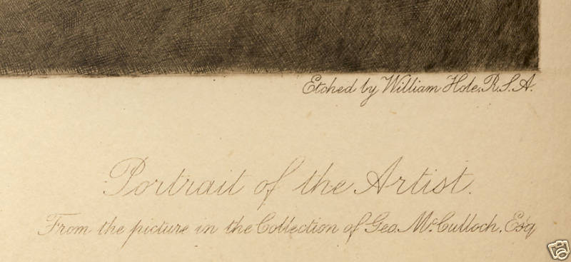
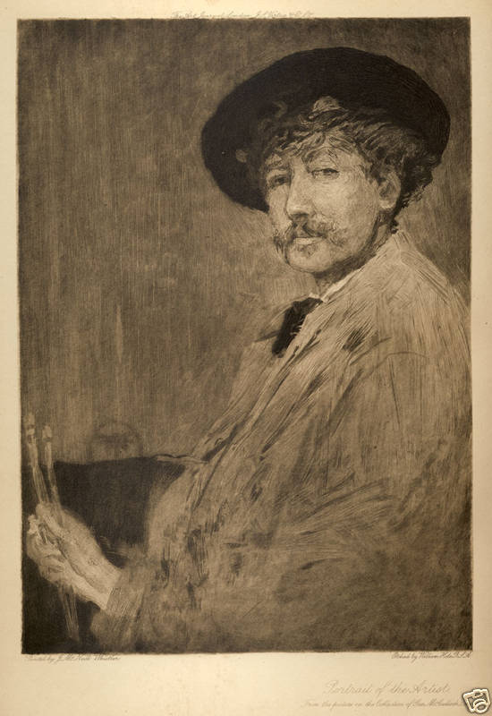
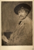
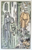
“Self Portrait of James Whistler†Etching by William Brasse Hole
William Brasse Hole A Scottish landscape etcher and painter, William B. Hole studied at More »
“Self Portrait of James Whistler†Etching by William Brasse Hole
William Brasse Hole A Scottish landscape etcher and painter, William B. Hole studied at the Royal Academy Schools, London. He began exhibiting his art there at the Royal Academy in 1873. Around 1875 the artist moved to Edinburgh and shortly thereafter became a member of both the Royal Scottish Academy and the Royal Scottish Watercolor Society. He was also a full member of the Royal Society of Painters and Etchers.
As an etcher, William Brasse Hole was equally adept at landscape studies, architectural views and portraits. He was a frequent contributor to “The Portfolioâ€, a journal which concentrated upon the art of etching and he also illustrated a number of fine books with his original plates.
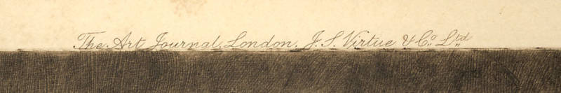
“Self Portrait of James Whistler†Etching by William Hole published 1897 by “The Art Journal†measuring 7 by 10 inches and in good condition. « Less
|
|
Art (paintings, prints, frames)
|
|
|
|
|
| Vendor Details |
Close |
| Contact Info : |
| House of Stow Galleries |
| Email : xlijstow@aol.com |
|
|
|
|
|
|
Price :
$125.00
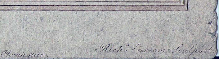
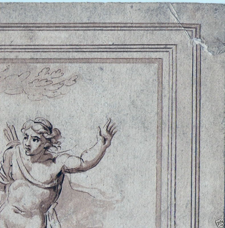
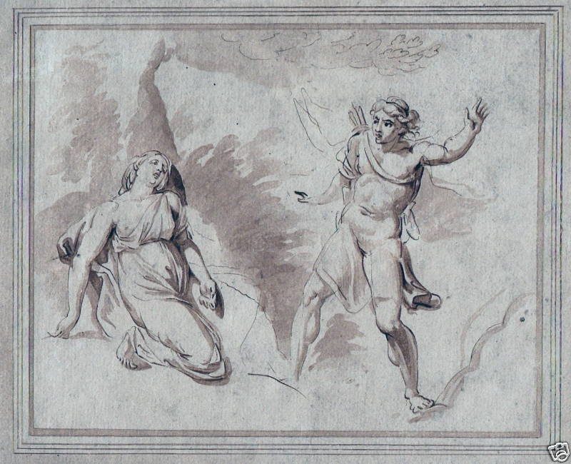
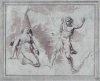
Giovanni Battista Cipriani “Cephalus & Piocris†Engraving
Giovanni Battista Cipriani (1727—1785), Italian painter and engraver, Pistoiese by More »
Giovanni Battista Cipriani “Cephalus & Piocris†Engraving
Giovanni Battista Cipriani (1727—1785), Italian painter and engraver, Pistoiese by descent, was born in Florence.
His first lessons were given him by a Florentine of English descent, Ignatius Hugford, and then under Anton Domenico Gabbiani. He was in Rome from 1750-1753, where he became acquainted with Sir William Chambers, the architect, and Joseph Wilton, the sculptor, whom he accompanied to England in August 1755.
He had already painted two pictures for the abbey of San Michele in Pelago, Pistoia, which had brought him reputation, and on his arrival in England he was patronized by Lord Tilney, the duke of Richmond and other noblemen. His acquaintance with Sir William Chambers no doubt helped him on, for when this architect designed the Albany in London for Lord Holland, Cipriani painted a ceilings, He also painted part of a ceiling in Buckingham House, and a room with poetical subjects at Standlynch in Wiltshire.
Among his masterpieces were his work for Somerset House, built by his friend Chambers. He not only prepared the decorations for the interior of the north block, but says Joseph Baretti in his Guide through the Royal Academy (1780), “the whole of the carvings in the various fronts of Somerset Place — excepting Bacon’s bronze figures — were carved from finished drawings made by Cipriani.†These designs include the five masks forming the keystones to the arches on the courtyard side of the vestibule, and the two above the doors leading into the wings of the north block, all of which are believed to have been carved by Nollekens. The grotesque groups flanking the main doorways on three sides of the quadrangle and the central doorway on the terrace appear also to have been designed by Cipriani.
The apartments in Sir William Chambers’s stately palace that were assigned to the Royal Academy, into which it moved in 1750, owed much to Cipriani’s graceful, if mannered, pencil. The central panel of the library ceiling was painted by Sir Joshua Reynolds, but the four compartments in the coves, representing Allegory, Fable, Nature and History, were Cipriani’s. These paintings still remain at Somerset House, together with the emblematic painted ceiling, also his work, of what was once the library of the Royal Society.
It was natural that Cipriani should thus devote himself to adorning the apartments of the academy, since he was an original member (1768) of that body, for which he designed the diploma so well engraved by Bartolozzi. In recognition of his services in this respect the members presented him in 1769 with a silver cup with a commemorative inscription. He was much employed by the publishers, for whom he made drawings in pen and ink, sometimes coloured. His friend Bartolozzi engraved most of them. Drawings by him are in both the British Museum and Victoria and Albert Museum. His best autograph engravings are “The Death of Cleopatra,†after Benvenuto Cellini; “The Descent of the Holy Ghost,†after Gabbiani; and portraits for Hollis’s memoirs, 1780. He painted allegorical designs for the Gold State Coach — which was still in use — in 1782, and repaired Verrio’s paintings at Windsor and Rubens’s ceiling in the Banqueting House at Whitehall.
Some of his best work is the decoration of furniture. He designed many groups, of nymphs and amorini and medallion subjects to form the centre of Pergolesi’s bands of ornament, and they were continually reproduced upon the elegant satin-wood furniture which was growing popular in his later days and by the end of the 18th century became a rage. Sometimes these designs were inlaid in marqueterie, but most frequently they were painted upon the satin-wood by other hands with delightful effect, since in the whole range of English furniture there is nothing more enchanting than really good finished satin-wood pieces. There can be little doubt that some of the beautiful furniture designed by the Adams was actually painted by Cipriani himself. He also occasionally designed handles for drawers and doors. Cipriani died at Hammersmith and was buried at Chelsea, where Bartolozzi erected a monument to his memory Apollo and Daphne Pyramus and This be Cephalus and Procris depected as a Calliope was the muse of epic poetry, Clio of history, Euterpe of lyric poetry … A cry from his beloved Piocris told him that the weapon had too surely met its mark.
Richard Earlom (1742—1822), English mezzotint engraver, was born and died in London. His natural faculty for art appears to have been first called into exercise by admiration for the lord mayor’s state coach, just decorated by Giovanni Battista Cipriani. He tried to copy the paintings, and was sent to study under Cipriani. He displayed great skill as a draughtsman, and at the same time acquired without assistance the art of engraving in mezzotint.
Giovanni Battista Cipriani “Cephalus & Piocris†Engraving from the drawing executed by Coprini, the noted Engraver Richard Earlom. Published 1786 by Joshua Boydell. This lovely engraving, printed in sepia and on laid paper, measures 6.50 by 7.50 inches (Engraved work inside of the inner border) with nice margins.There is a little flaw in the paper in the outer area of the engraved work, otherwise in decent condition.
« Less
|
|
Art (paintings, prints, frames)
|
|
|
|
|
| Vendor Details |
Close |
| Contact Info : |
| House of Stow Galleries |
| Email : xlijstow@aol.com |
|
|
|
|
|
|

Price :
$100.00
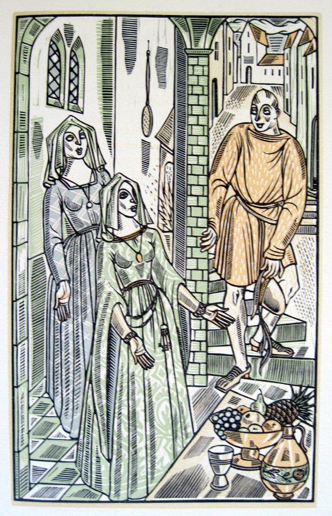
John Austen "Adriana — Comedy of Errors" Colored Wood Engraving
John Austen "Adriana — Comedy of Errors" Colored Wood Engraving Published 1939, by the More »
John Austen "Adriana — Comedy of Errors" Colored Wood Engraving
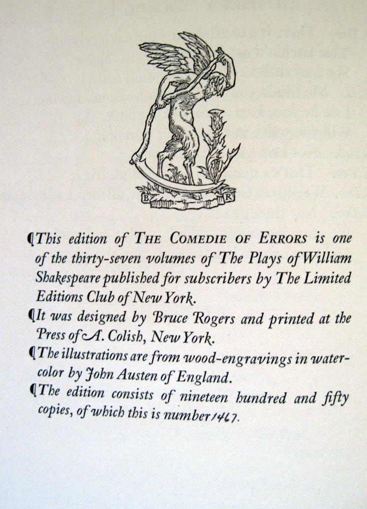
John Austen "Adriana — Comedy of Errors" Colored Wood Engraving Published 1939, by the Limited Editions Club of a limited edition of 1950, on high quality wove paper. The Images are all unsigned, measuring 5.5 by 9 inches on a sheet measuring 8.5 by 13 inches in excellent condition. The Colophon is NOT included BUT may be down loaded to keep with your purchase.
John Austen was born in Kent, England in 1886. That's the same year as Kay Nielsen, and both share a fascination with a style of art made most popular by Aubrey Beardsley (1872-1898). As Impressionism and Art Nouveau were confronting and confusing the public, the "decadent" style of Beardsley was finding its own audience. Harry Clarke, Nielsen, Alastair, and others were enamored with the strength of line and form and startling, solid blacks.
It wasn't until 1906 when Austen came to London, as a carpenter, that he was first exposed to Beardsley's work. The effect it had on him was said to be overwhelming and he began to study art - and Beardsley in particular. It wasn't until 1921 that he had his first illustrations published. The book was The Little Ape and despite being an obvious paean to his hero, the illustrations contain a seed of uniqueness that kept them being slavish copies.

Throughout the '20s he illustrated dozens of books, continually refining and simplifying his style while practicing to be, as Dorothy Richardson says in her essential, John Austen and the Inseparables, "...the perfect aesthete, precious, even in appearance, to the finger-tips; and a trifle cynical." The self-portrait in woodcut above is taken from that book.
In 1927, he illustrated The Gods are Athirst, one of the Dodd-Mead series of Anatole France reprints, best typified by the volumes by Frank Papé. The sample image at right shows that he certainly had the manner of the "aesthete" captured perfectly. Love the slippers.
By 1930, he'd abandoned the pretenses of the London "artiste" and was back in Kent. The style he had settled into was similar to the fine-line and cross-hatch texturing of the cherub at left from The Guardsman and Cupid's Daughter (1930). Much of the decade of the '30s was devoted to books for the Heritage Press or the Illustrated Editions Club.
Some of the titles: Vanity Fair, Pickwick Papers,David Copperfield, Oliver Wakefield, and A Comedy of Errors.
He wrote a book titled The ABC of Pen and Ink Renderingin 1937. He wrote and illustrated Persuasion in 1946. He died in 1948. « Less
|
|
Art (paintings, prints, frames)
|
|
|
|
|
| Vendor Details |
Close |
| Contact Info : |
| House of Stow Galleries |
| Email : xlijstow@aol.com |
|
|
|
|
|
|

Price :
$100.00
John Austen "Duke — Comedy of Errors" Colored Wood Engraving
John Austen "Duke — Comedy of Errors" Colored Wood Engraving Published 1939, by the Limited More »
John Austen "Duke — Comedy of Errors" Colored Wood Engraving
John Austen "Duke — Comedy of Errors" Colored Wood Engraving Published 1939, by the Limited Editions Club of a limited edition of 1950, on high quality wove paper. The Images are all unsigned, measuring 5.5 by 9 inches on a sheet measuring 8.5 by 13 inches in excellent condition. The Colophon is NOT included BUT may be down loaded to keep with your purchase.
John Austen was born in Kent, England in 1886. That's the same year as Kay Nielsen, and both share a fascination with a style of art made most popular by Aubrey Beardsley (1872-1898). As Impressionism and Art Nouveau were confronting and confusing the public, the "decadent" style of Beardsley was finding its own audience. Harry Clarke, Nielsen, Alastair, and others were enamored with the strength of line and form and startling, solid blacks.
It wasn't until 1906 when Austen came to London, as a carpenter, that he was first exposed to Beardsley's work. The effect it had on him was said to be overwhelming and he began to study art - and Beardsley in particular. It wasn't until 1921 that he had his first illustrations published. The book was The Little Ape and despite being an obvious paean to his hero, the illustrations contain a seed of uniqueness that kept them being slavish copies.

Throughout the '20s he illustrated dozens of books, continually refining and simplifying his style while practicing to be, as Dorothy Richardson says in her essential, John Austen and the Inseparables, "...the perfect aesthete, precious, even in appearance, to the finger-tips; and a trifle cynical." The self-portrait in woodcut above is taken from that book.
In 1927, he illustrated The Gods are Athirst, one of the Dodd-Mead series of Anatole France reprints, best typified by the volumes by Frank Papé. The sample image at right shows that he certainly had the manner of the "aesthete" captured perfectly. Love the slippers.
By 1930, he'd abandoned the pretenses of the London "artiste" and was back in Kent. The style he had settled into was similar to the fine-line and cross-hatch texturing of the cherub at left from The Guardsman and Cupid's Daughter (1930). Much of the decade of the '30s was devoted to books for the Heritage Press or the Illustrated Editions Club.
Some of the titles: Vanity Fair, Pickwick Papers,David Copperfield, Oliver Wakefield, and A Comedy of Errors.
He wrote a book titled The ABC of Pen and Ink Renderingin 1937. He wrote and illustrated Persuasion in 1946. He died in 1948. « Less
|
|
Art (paintings, prints, frames)
|
|
|
|
|
| Vendor Details |
Close |
| Contact Info : |
| House of Stow Galleries |
| Email : xlijstow@aol.com |
|
|
|
|
|
|
Price :
$100.00
John Austen "E Dro — Comedy of Errors" Colored Wood Engraving
John Austen "E Dro — Comedy of Errors" Colored Wood Engraving Published 1939, by the Limited More »
John Austen "E Dro — Comedy of Errors" Colored Wood Engraving
John Austen "E Dro — Comedy of Errors" Colored Wood Engraving Published 1939, by the Limited Editions Club of a limited edition of 1950, on high quality wove paper. The Images are all unsigned, measuring 5.5 by 9 inches on a sheet measuring 8.5 by 13 inches in excellent condition. The Colophon is NOT included BUT may be down loaded to keep with your purchase.
John Austen was born in Kent, England in 1886. That's the same year as Kay Nielsen, and both share a fascination with a style of art made most popular by Aubrey Beardsley (1872-1898). As Impressionism and Art Nouveau were confronting and confusing the public, the "decadent" style of Beardsley was finding its own audience. Harry Clarke, Nielsen, Alastair, and others were enamored with the strength of line and form and startling, solid blacks.
It wasn't until 1906 when Austen came to London, as a carpenter, that he was first exposed to Beardsley's work. The effect it had on him was said to be overwhelming and he began to study art - and Beardsley in particular. It wasn't until 1921 that he had his first illustrations published. The book was The Little Ape and despite being an obvious paean to his hero, the illustrations contain a seed of uniqueness that kept them being slavish copies.

Throughout the '20s he illustrated dozens of books, continually refining and simplifying his style while practicing to be, as Dorothy Richardson says in her essential, John Austen and the Inseparables, "...the perfect aesthete, precious, even in appearance, to the finger-tips; and a trifle cynical." The self-portrait in woodcut above is taken from that book.
In 1927, he illustrated The Gods are Athirst, one of the Dodd-Mead series of Anatole France reprints, best typified by the volumes by Frank Papé. The sample image at right shows that he certainly had the manner of the "aesthete" captured perfectly. Love the slippers.
By 1930, he'd abandoned the pretenses of the London "artiste" and was back in Kent. The style he had settled into was similar to the fine-line and cross-hatch texturing of the cherub at left from The Guardsman and Cupid's Daughter (1930). Much of the decade of the '30s was devoted to books for the Heritage Press or the Illustrated Editions Club.
Some of the titles: Vanity Fair, Pickwick Papers,David Copperfield, Oliver Wakefield, and A Comedy of Errors.
He wrote a book titled The ABC of Pen and Ink Renderingin 1937. He wrote and illustrated Persuasion in 1946. He died in 1948. « Less
|
|
Art (paintings, prints, frames)
|
|
|
|
|
| Vendor Details |
Close |
| Contact Info : |
| House of Stow Galleries |
| Email : xlijstow@aol.com |
|
|
|
|
|
|

Price :
$100.00
John Austen "Luciana — Comedy of Errors" Colored Wood Engraving
John Austen "Luciana — Comedy of Errors" Colored Wood Engraving Published 1939, by the More »
John Austen "Luciana — Comedy of Errors" Colored Wood Engraving
John Austen "Luciana — Comedy of Errors" Colored Wood Engraving Published 1939, by the Limited Editions Club of a limited edition of 1950, on high quality wove paper. The Images are all unsigned, measuring 5.5 by 9 inches on a sheet measuring 8.5 by 13 inches in excellent condition. The Colophon is NOT included BUT may be down loaded to keep with your purchase.
John Austen was born in Kent, England in 1886. That's the same year as Kay Nielsen, and both share a fascination with a style of art made most popular by Aubrey Beardsley (1872-1898). As Impressionism and Art Nouveau were confronting and confusing the public, the "decadent" style of Beardsley was finding its own audience. Harry Clarke, Nielsen, Alastair, and others were enamored with the strength of line and form and startling, solid blacks.
It wasn't until 1906 when Austen came to London, as a carpenter, that he was first exposed to Beardsley's work. The effect it had on him was said to be overwhelming and he began to study art - and Beardsley in particular. It wasn't until 1921 that he had his first illustrations published. The book was The Little Ape and despite being an obvious paean to his hero, the illustrations contain a seed of uniqueness that kept them being slavish copies.

Throughout the '20s he illustrated dozens of books, continually refining and simplifying his style while practicing to be, as Dorothy Richardson says in her essential, John Austen and the Inseparables, "...the perfect aesthete, precious, even in appearance, to the finger-tips; and a trifle cynical." The self-portrait in woodcut above is taken from that book.
In 1927, he illustrated The Gods are Athirst, one of the Dodd-Mead series of Anatole France reprints, best typified by the volumes by Frank Papé. The sample image at right shows that he certainly had the manner of the "aesthete" captured perfectly. Love the slippers.
By 1930, he'd abandoned the pretenses of the London "artiste" and was back in Kent. The style he had settled into was similar to the fine-line and cross-hatch texturing of the cherub at left from The Guardsman and Cupid's Daughter (1930). Much of the decade of the '30s was devoted to books for the Heritage Press or the Illustrated Editions Club.
Some of the titles: Vanity Fair, Pickwick Papers,David Copperfield, Oliver Wakefield, and A Comedy of Errors.
He wrote a book titled The ABC of Pen and Ink Renderingin 1937. He wrote and illustrated Persuasion in 1946. He died in 1948. « Less
|
|
Art (paintings, prints, frames)
|
|
|
|
|
| Vendor Details |
Close |
| Contact Info : |
| House of Stow Galleries |
| Email : xlijstow@aol.com |
|
|
|
|
|
|
Price :
$95.00
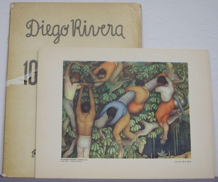
Mexico: Eugene Fischgrund, 1946. Mild wear to the spine ends of the folder. Portfolio with Ten plates and the text folio are all present in very good condition, 1st Edition. More »
Mexico: Eugene Fischgrund, 1946. Mild wear to the spine ends of the folder. Portfolio with Ten plates and the text folio are all present in very good condition, 1st Edition. Book is complete with Hardcover glassine D.J. Condition: very good « Less
|
|
Illustrations
|
|
|
|
|
| Vendor Details |
Close |
| Contact Info : |
| Fine art museum inc. |
| 27601 Forbes rd, suite 37 |
| Laguna Niguel |
| California-92677 |
| USA |
| Email : art@fineartmuseum.net |
| Phone : 9497358386 |
|
|
|
|
|
|

Price :
$13440.00
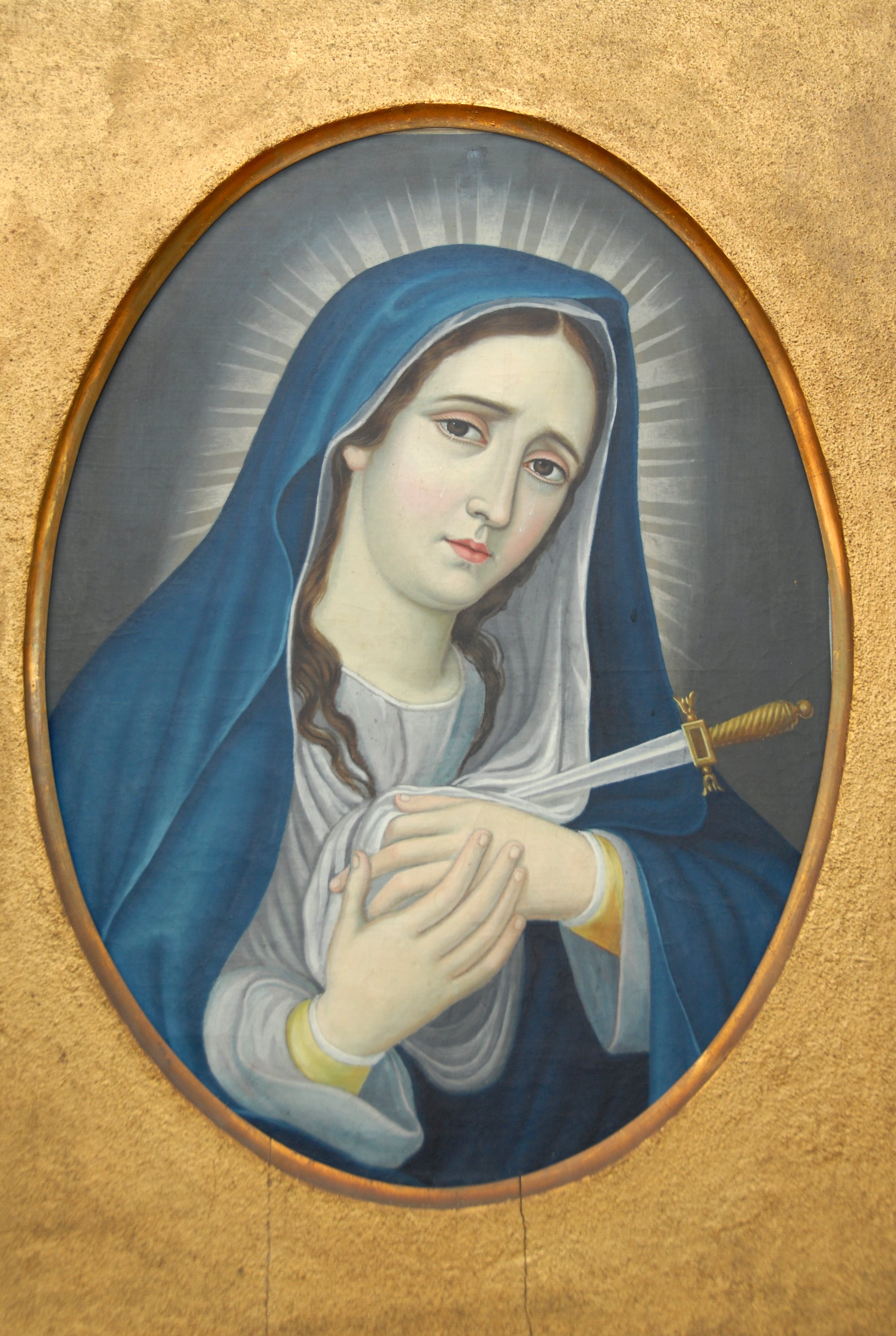
Author: José MarÃa Zepeda y Estrada
Age: 22 junio 1845
• Size: 56 cm hight, 42.5 width.
• Oil.
• Signature by the author
Author: José MarÃa Zepeda y Estrada
Age: 22 junio 1845
• Size: 56 cm hight, 42.5 width.
• Oil.
• Signature by the author « Less
|
|
Religious & Inspirational
|
|
|
|
|
| Vendor Details |
Close |
| Contact Info : |
| Ricardo |
| Email : meniomenio@hotmail.com |
| Phone : +5213310462413 |
|
|
|
|
|
|
|
|

|